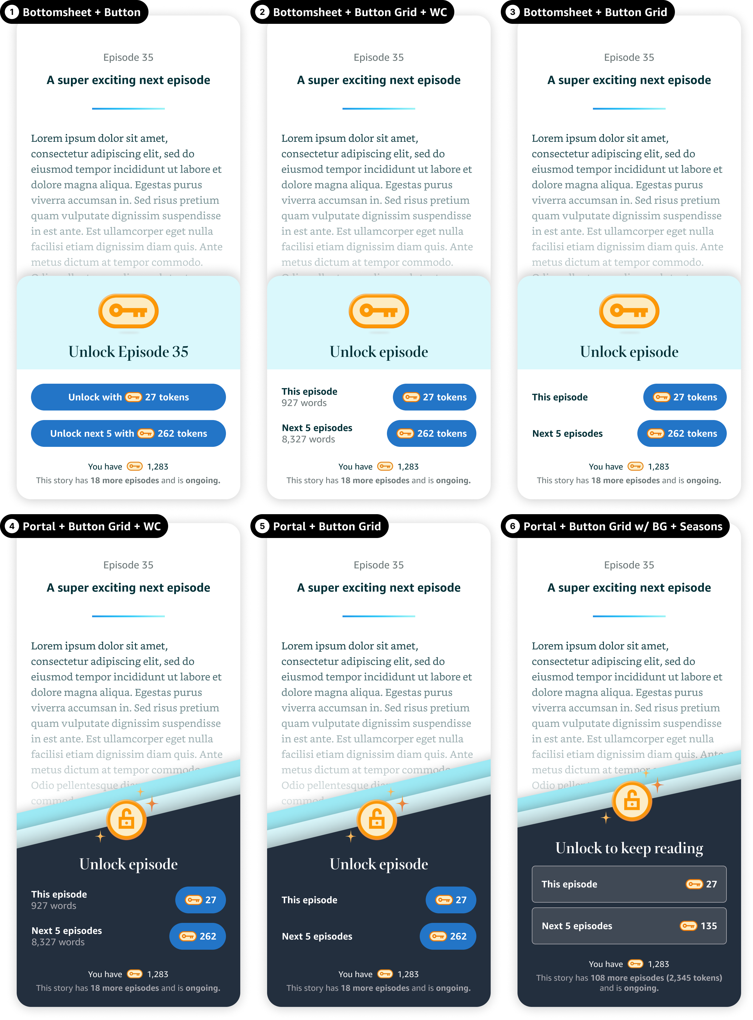
After launching Kindle Vella in 2021, the team started to hear some customer feedback on the unlock experience: unlocking episodes was just way too cumbersome. I was asked to find a way to make it easier.
Assessing the situation
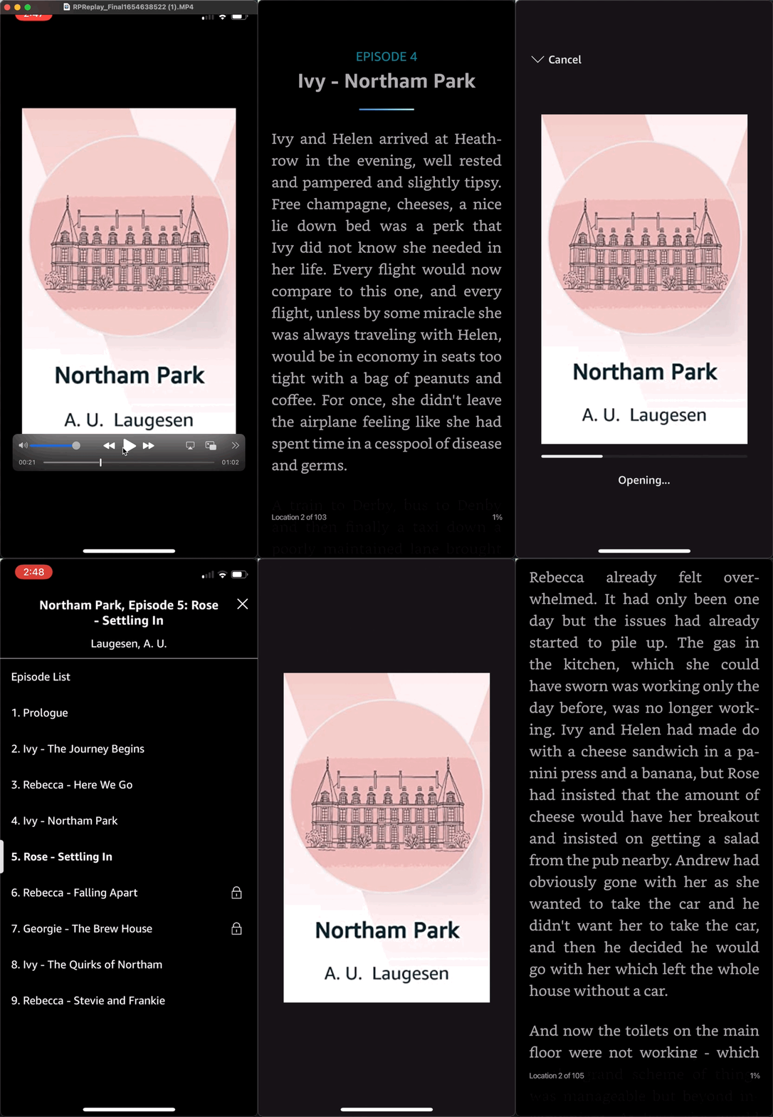
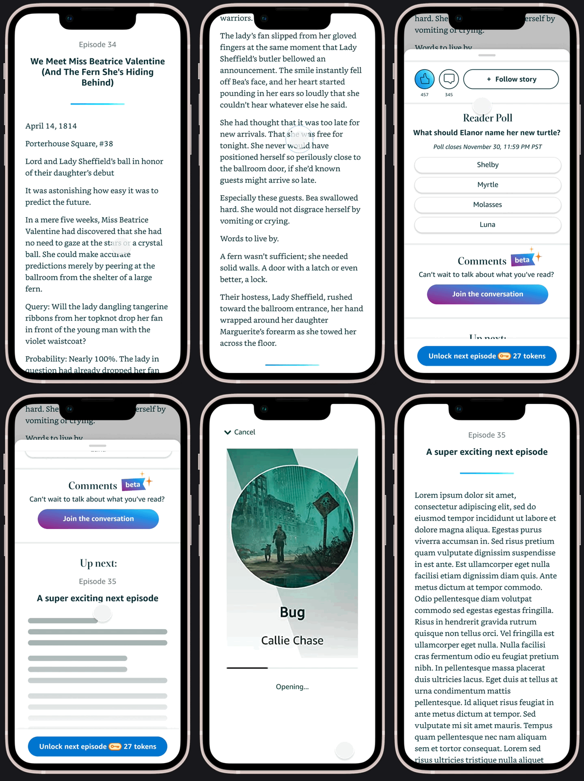
I started out with a competitive analysis of similar features in similar products. To get from one episode to the next, readers had to swipe up from the end of the episode, tap the "next episode" button, wait for the next episode to load, then wait for the paywall to load, and then (finally) tap the unlock button to get reading.
Allow users to bulk unlock chapters. [...] Allow users to scroll to the next story without all the button clicks. You make your users work too hard to give you money.
— Author feedback
Compared to competitors like Wattpad and WEBTOON, our experience had an additional 2 - 3 steps. Compared to television apps like Netflix that automatically forwarded you to the next episode, our CX felt even more cumbersome.
Ideating
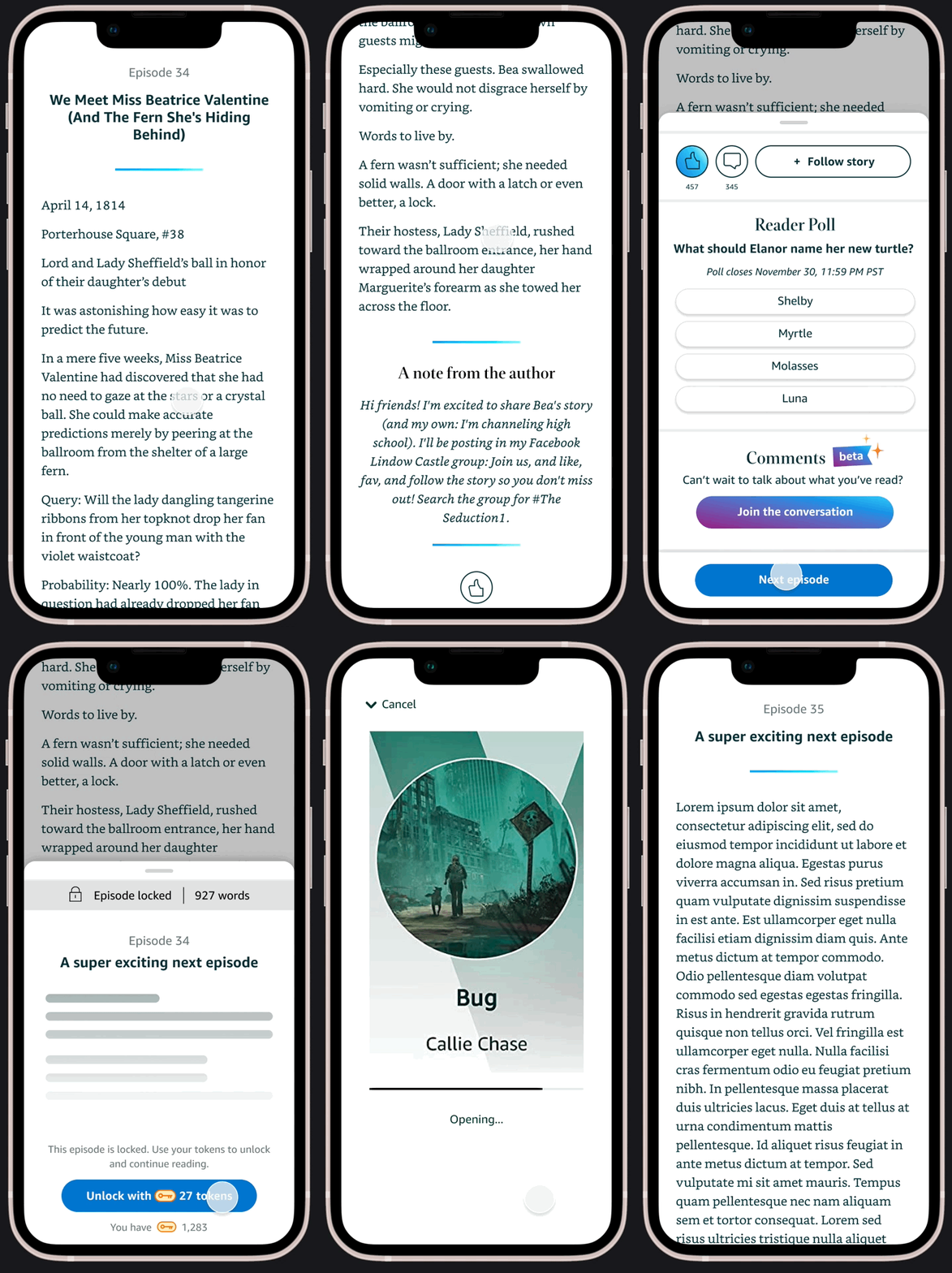
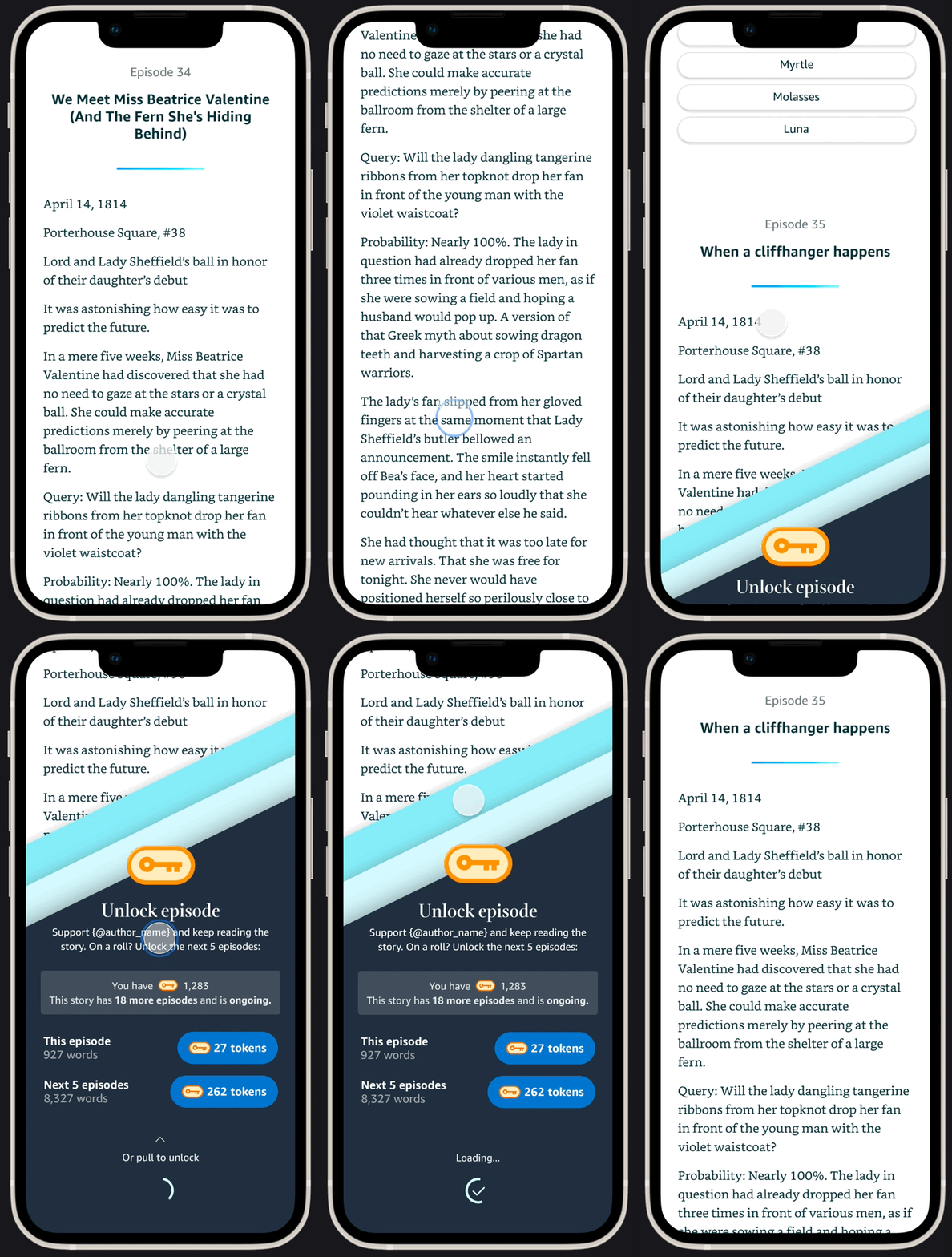
The original brief from the Product team was to design a solution that would allow customers to unlock multiple episodes at once. But it seemed like there were other opportunities to reduce friction in the CX, and so I started exploring in prototypes.
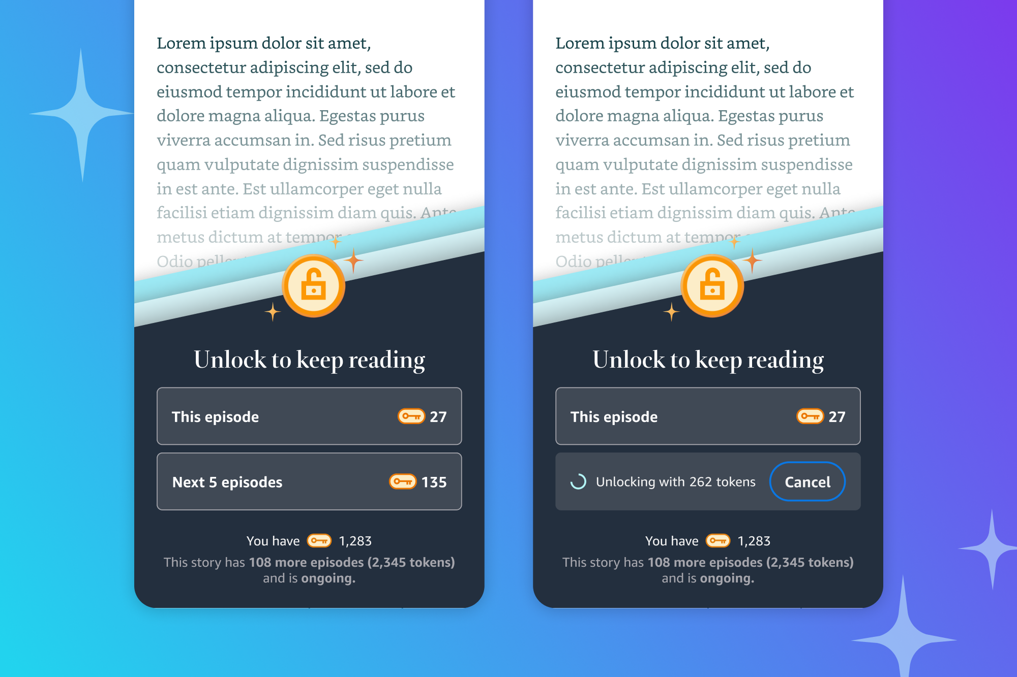
✨ Gif-stravaganza I like to bring in prototypes & motion design really early on in my process. I find that the right interaction design actually informs layout choices & patterns, and motion gives stakeholders a much better sense of user friction than static screens.
Making it lovely ✨
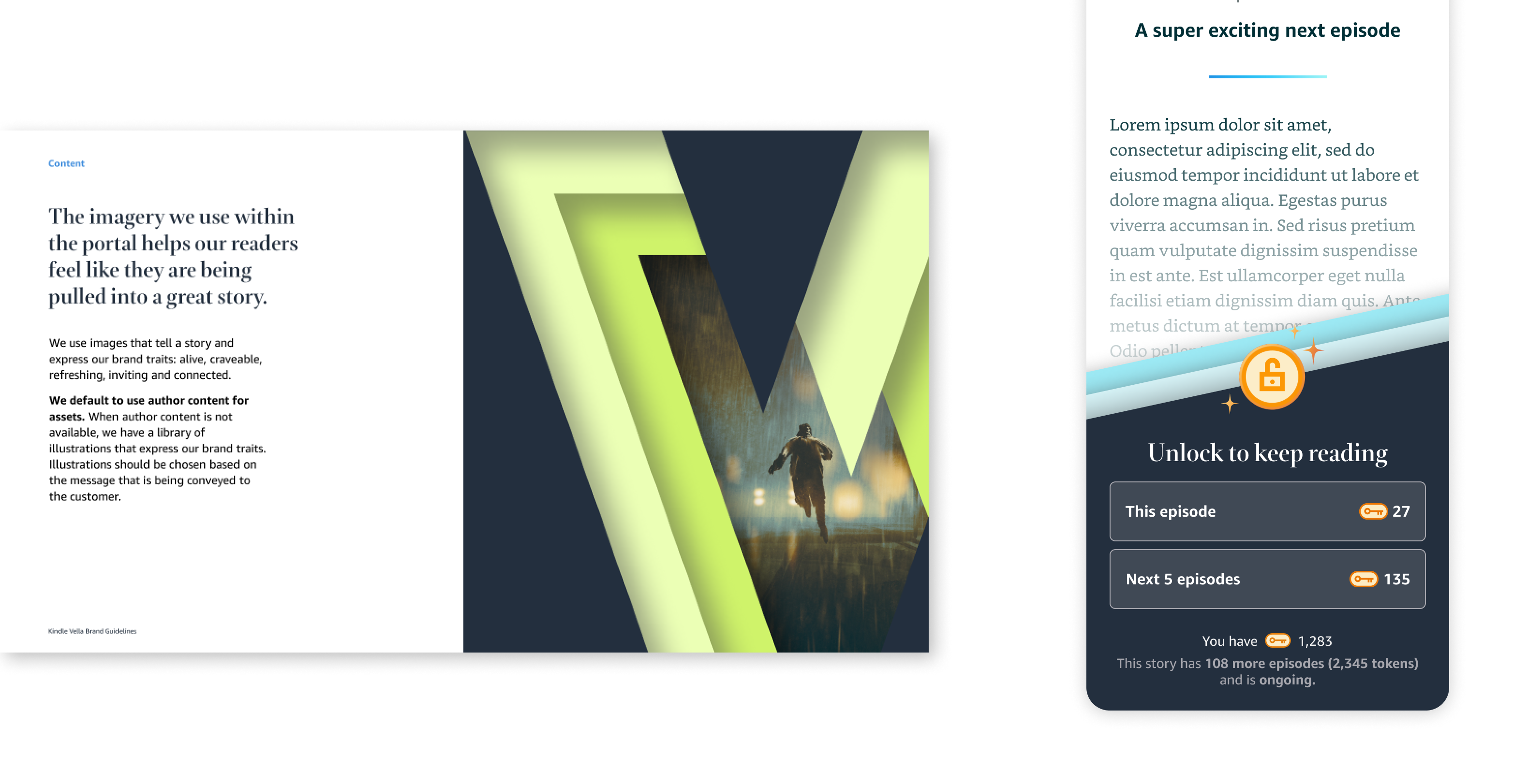
Ultimately, we decided to launch the bulk unlock feature first. To make the unlock screen easier to parse, I gave it a branded glow-up. In particular, I wanted to incorporate Kindle Vella's signature "v-portal" element into the paywall, drawing on the element's design that invites readers to dive into the story.