In partnership with Whole Foods Market and the Humane Society of the United States, the creative agency I work for produced a feature documentary that explores how farm animals are raised for our consumption. I worked on two deliverables for the distribution & marketing campaign for the film: a website, and the interaction design for a 3D virtual reality app that explored the farms that the filmmakers visited.
The challenge
Our clients had two goals: educate shoppers about animal welfare, and encourage them to watch the documentary. Most app users would be in a distracting environment — in a grocery store pop-up, or at film festivals — so we needed to make the app delightful, engaging, and extremely easy to use to keep users engaged.
Show, don't tell
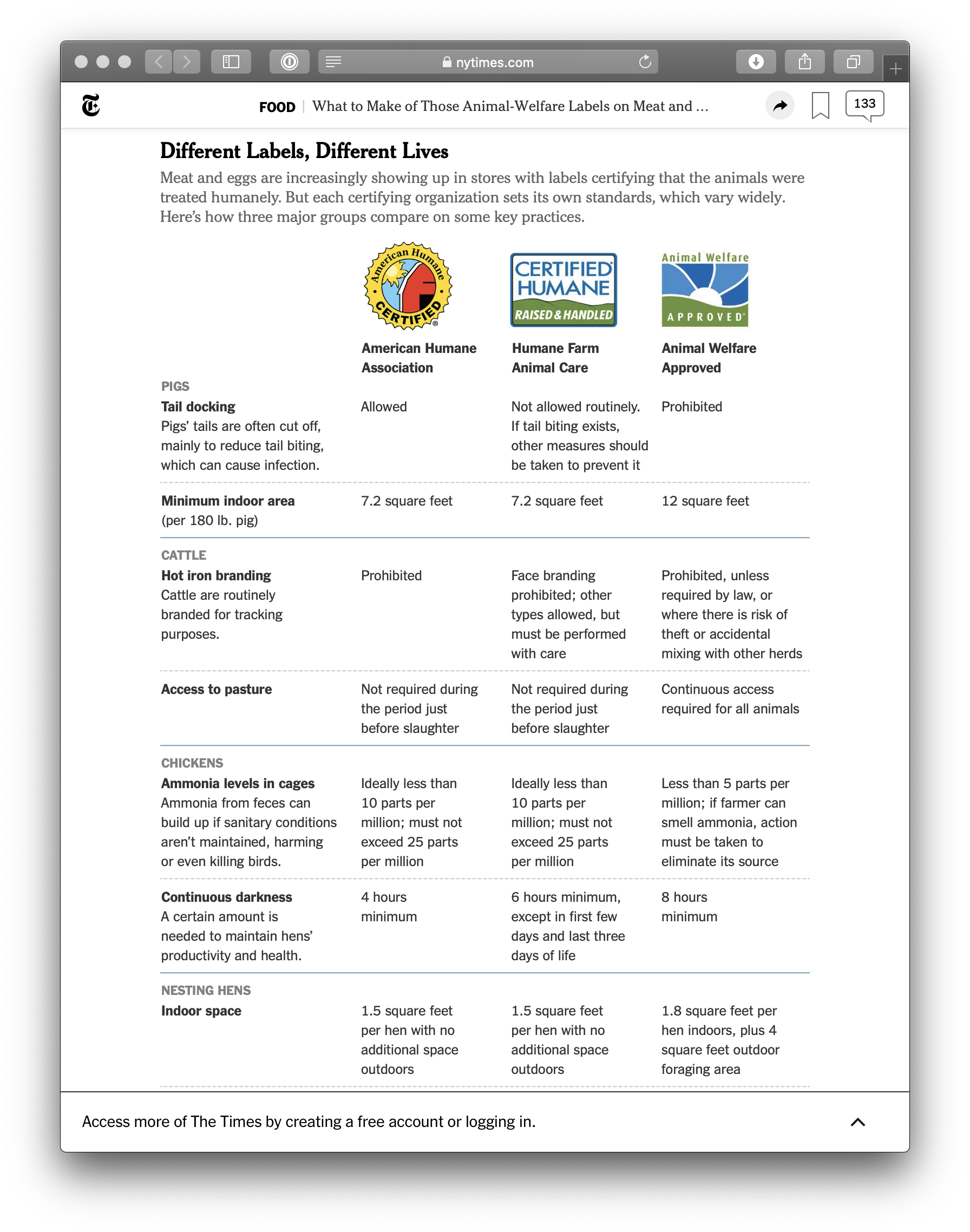
For shoppers who want to buy humane products, grocery stores are a maze of confusing labels. In our research, we found that people were already trying to explain these labels, but their clinical descriptions left us feeling more confused. How much is 10 parts per million of ammonia? What exactly is a "foraging area"? How much darkness do chickens like having?
We wanted to avoid yet another explanation of labels our users wouldn't recognize with jargon they didn't understand. Instead, we wanted to show them what humane animal farming actually looked like.
Our solution? Show, don't tell. We would use 360-degree virtual reality to invite shoppers to see what farms — good and bad — were really like.
✨ How might we: show users what labels mean, without overwhelming them?
Hi, can I strap this piece of cardboard to your face?
But first, there were a few challenges to overcome with our concept:
Users feel anxiety about the material
People don't want to see animals in pain. This seems obvious, but it was a major issue in getting people to even consider trying the (hypothetical) VR app. Shoppers we interviewed were familiar with recent grainy, undercover exposé videos of cows being abused at "conventional" farms — and, understandably, didn't want to strap that onto their face.
Oh, uh, I don't know, I'm not sure I want to see animals in situations like that. — quote from early user interview
We knew we'd need to use design to build trust with our users as quickly as possible, and help them understand that the experience we offered would be interesting, but safe.
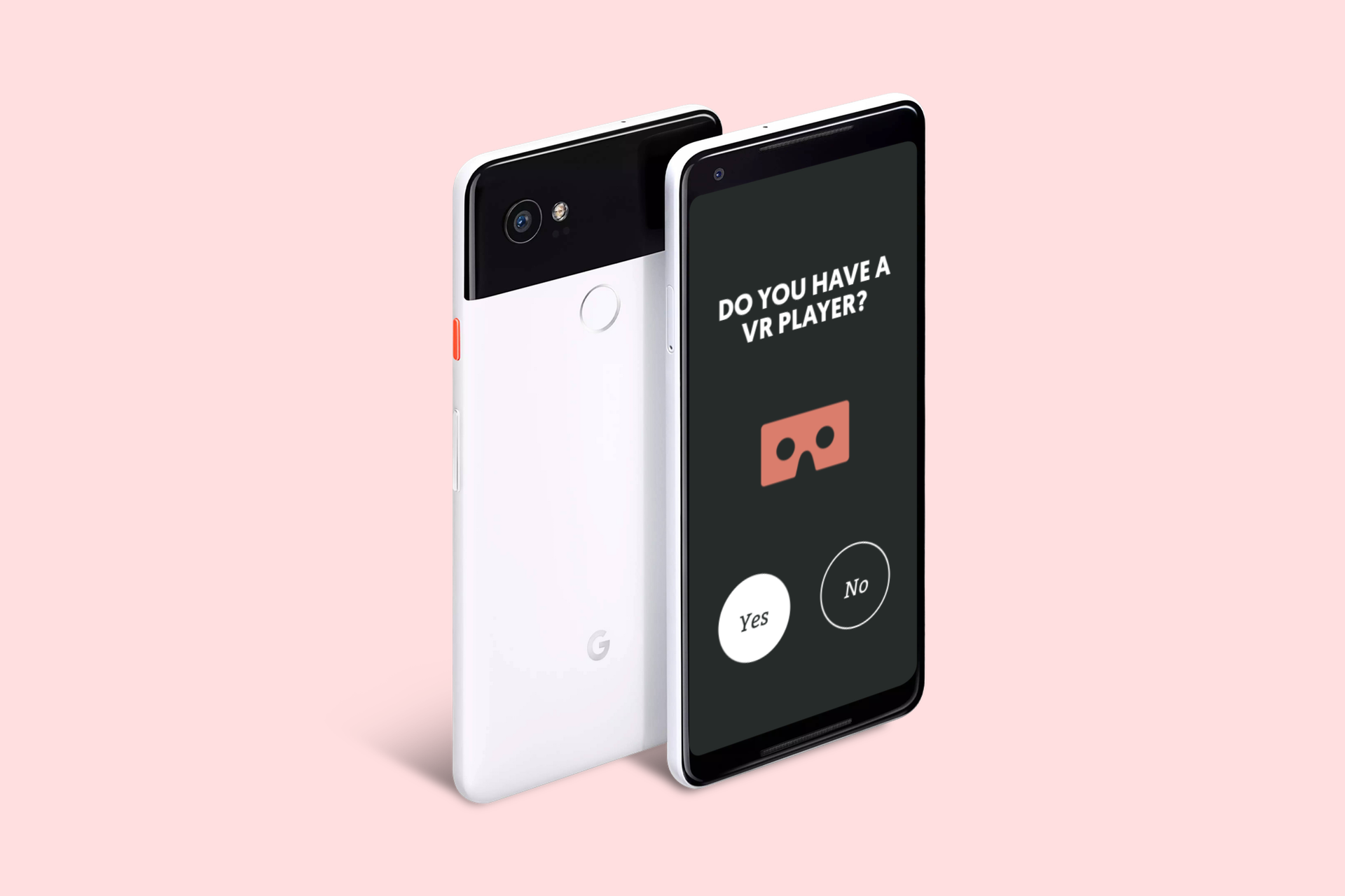
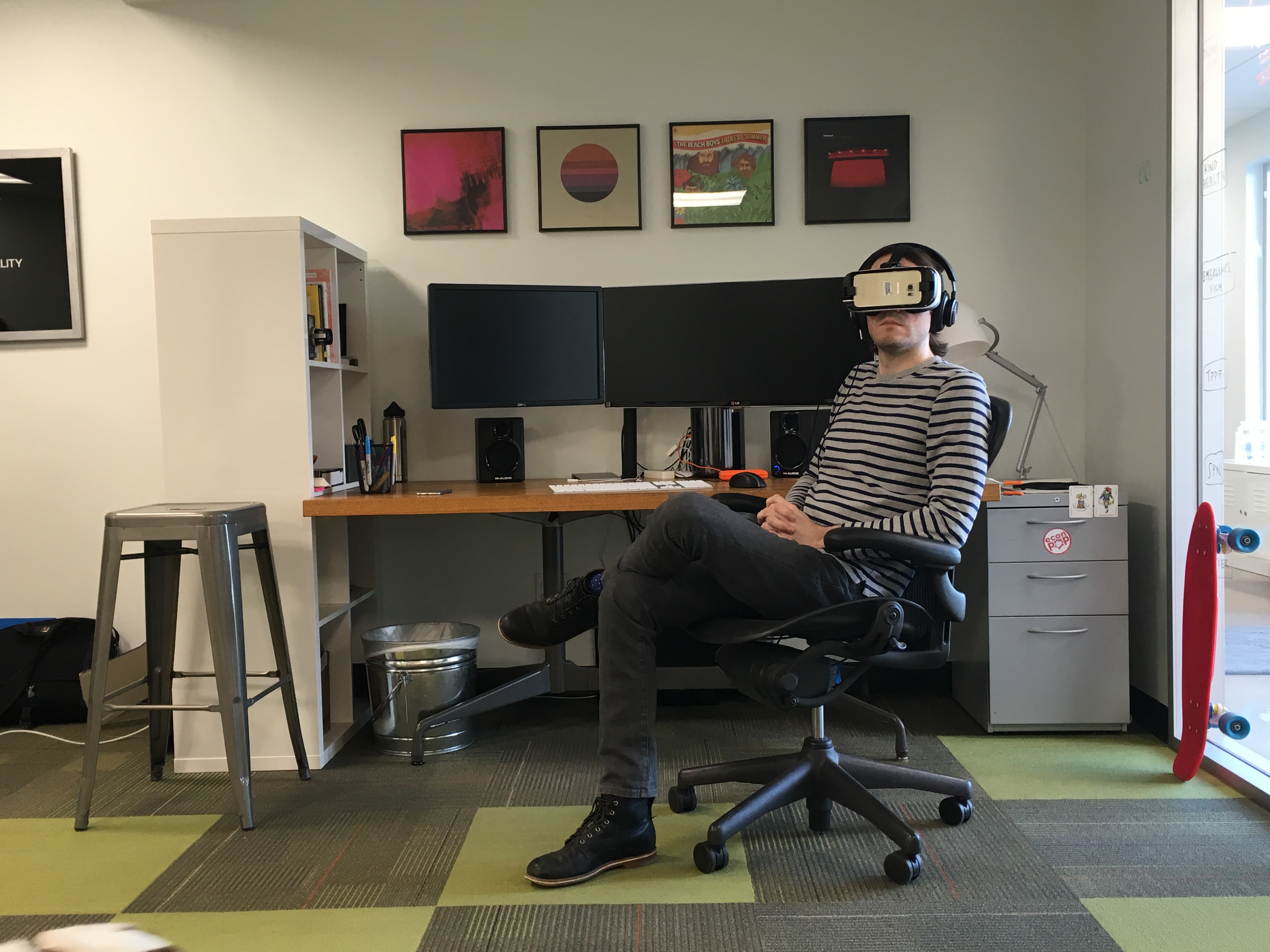
Headsets aren't intuitive for most people
The transition from 2D to 3D is weird, cumbersome, and confusing for first-time users. Part of the marketing plan involved distributing free Google Cardboards in Whole Foods Markets around the country, with QR codes stamped on them that linked to the app. We expected that most users would be first-timers, and we wanted to create a seamless and enjoyable experience, even for VR newbies.
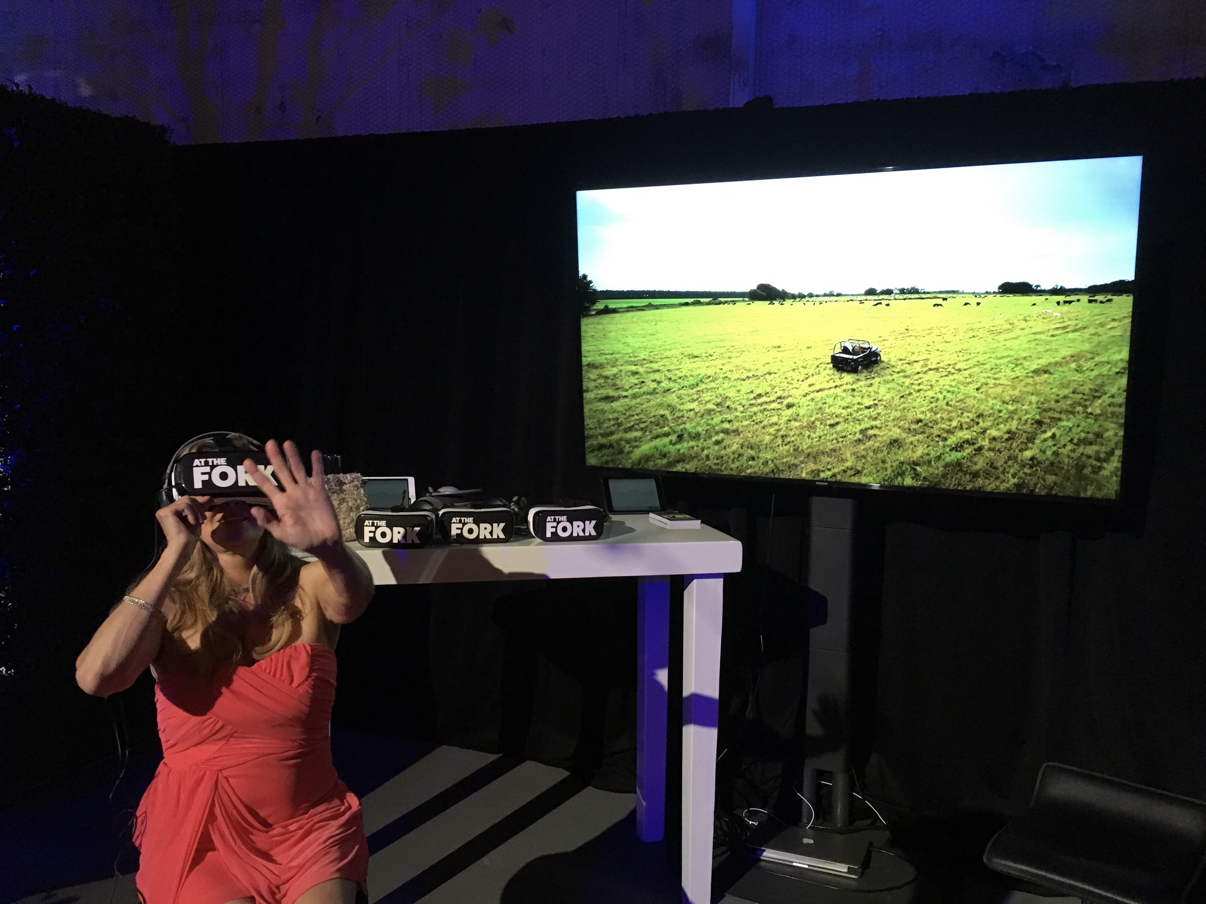
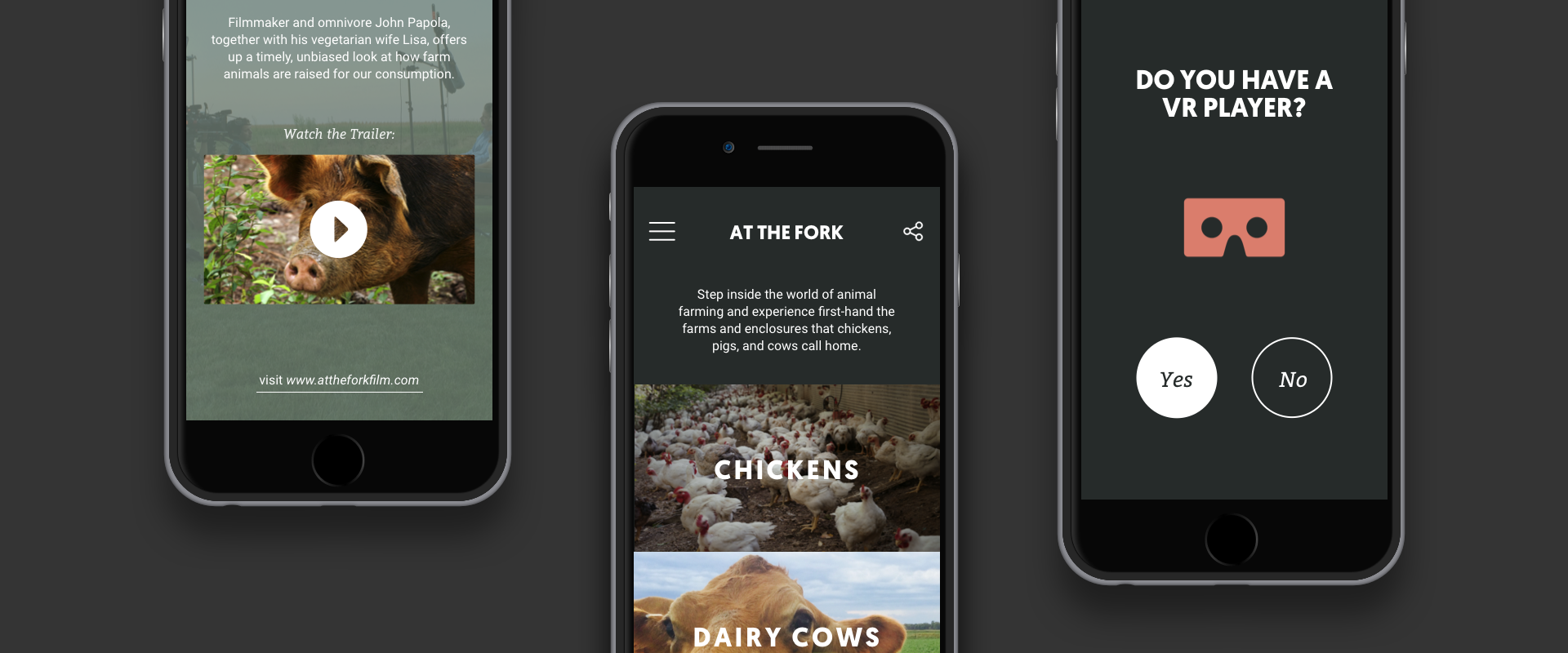
The 3D VR Experience
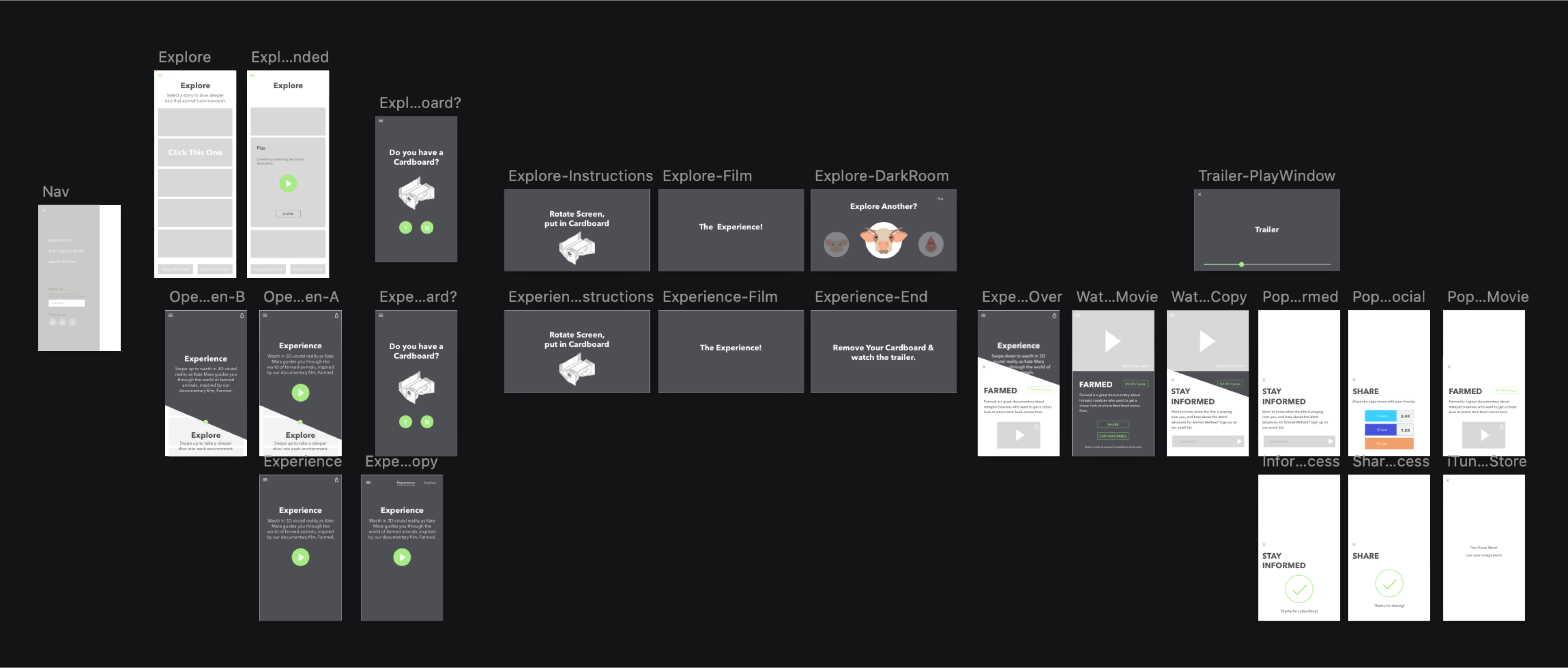
The first information architecture hurdle was organizing content so it was modular, without making our users make the 2D-to-3D switch more than once. We made three key decisions right away:
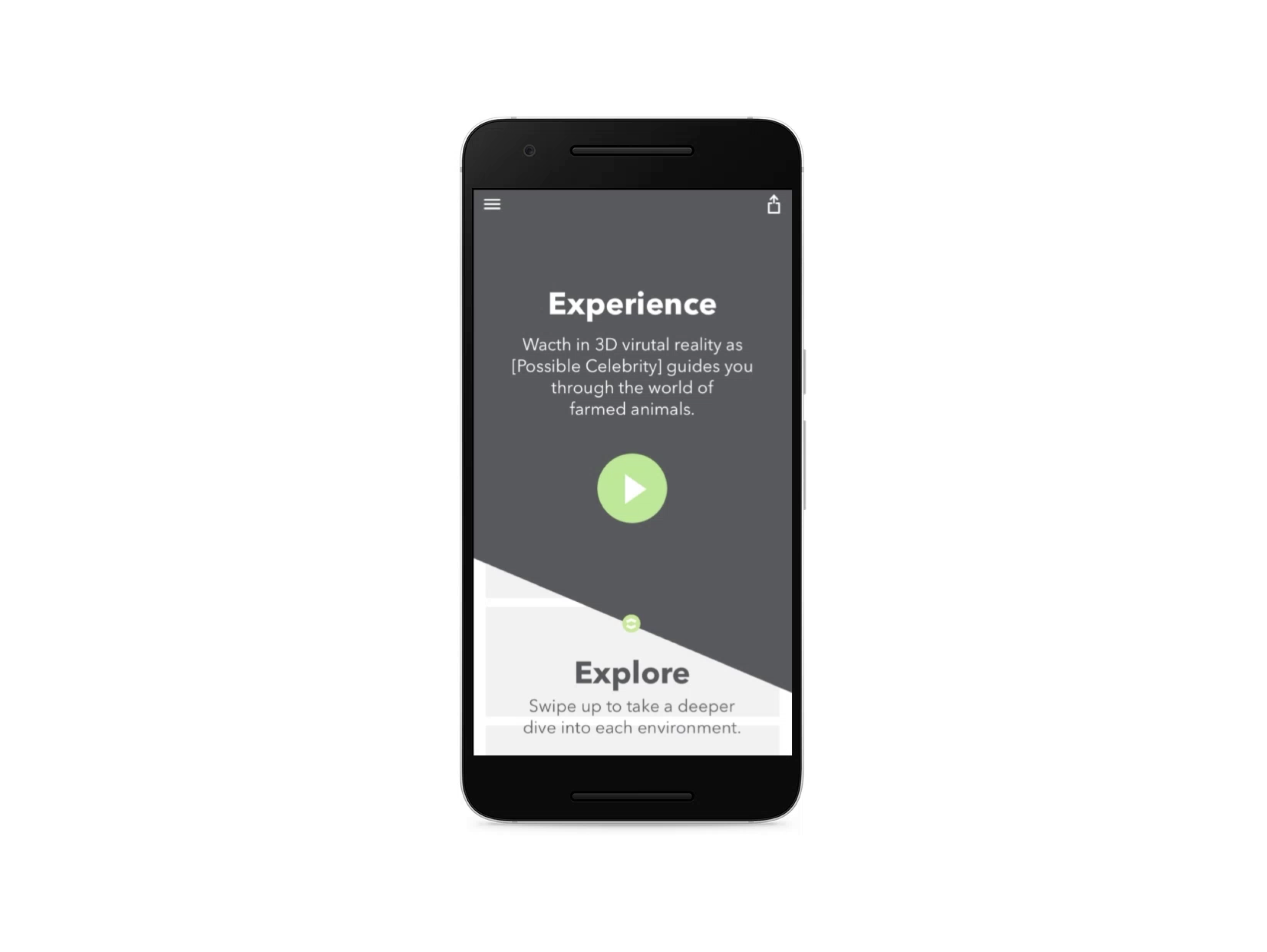
- We wanted to encourage people to jump into the "narrative story" first; it was the most compelling and beginner-friendly experience of the 6 videos.
- Once a user had inserted their phone into the Google Cardboard, we really didn't want to make them take it off until they were done being in VR.
- Once a user was done with their VR experience, we wanted to nudge them to visit the film's website or buy it on iTunes.
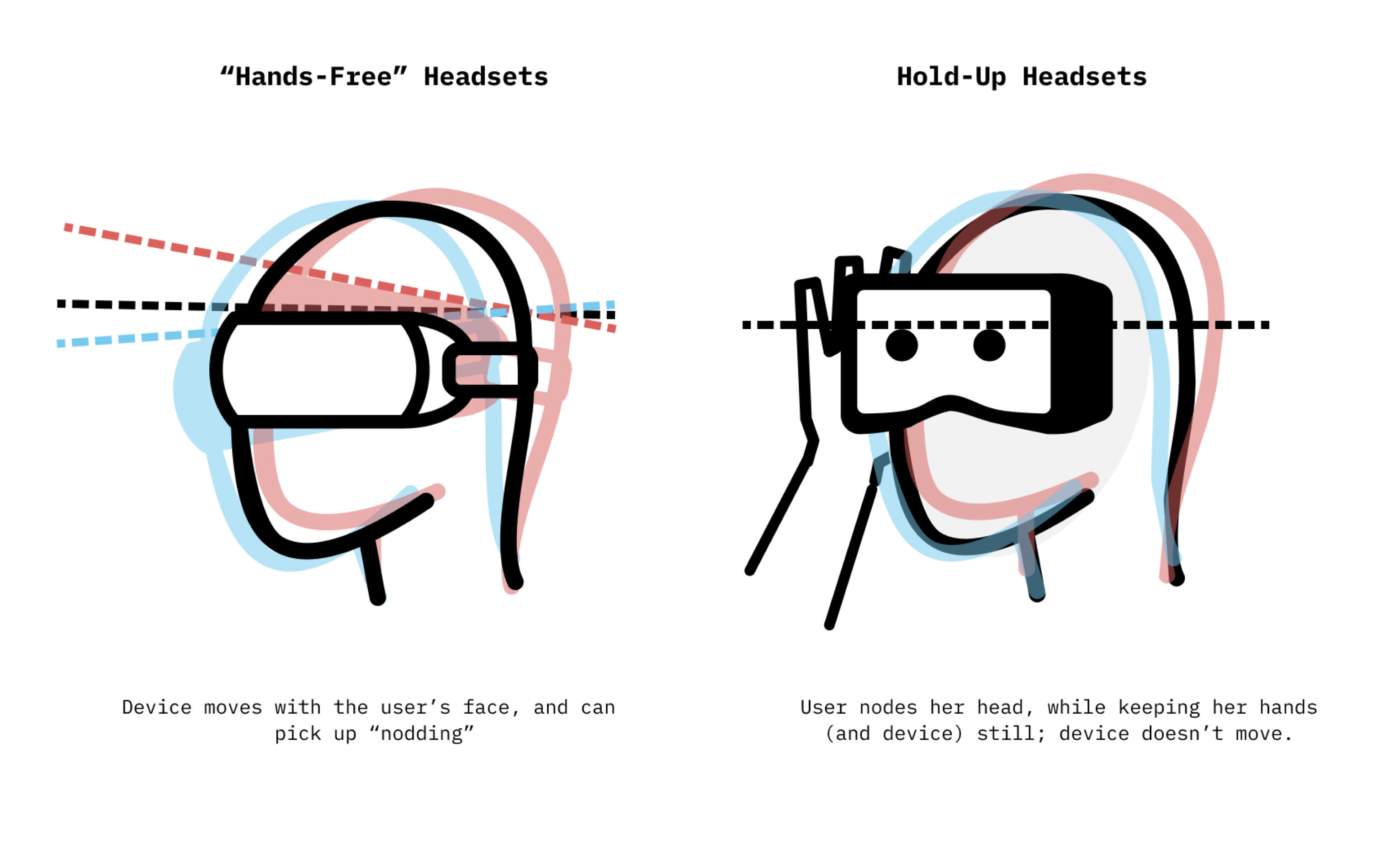
🧠 KEY INSIGHT Nodding in response to a question (i.e., "Continue?") worked really well for devices that are strapped to a user's head. It was a really intuitive and delightful interaction — we had a few users say, "Wow, it knows I'm nodding? That's so cool!" — but it utterly failed as soon as we switched to Google Cardboard. Cardboard is a device that the user has to hold up to their face with their hands, and every single one of our test subjects nodded their head while holding their hands (and therefore also the device) perfectly still.
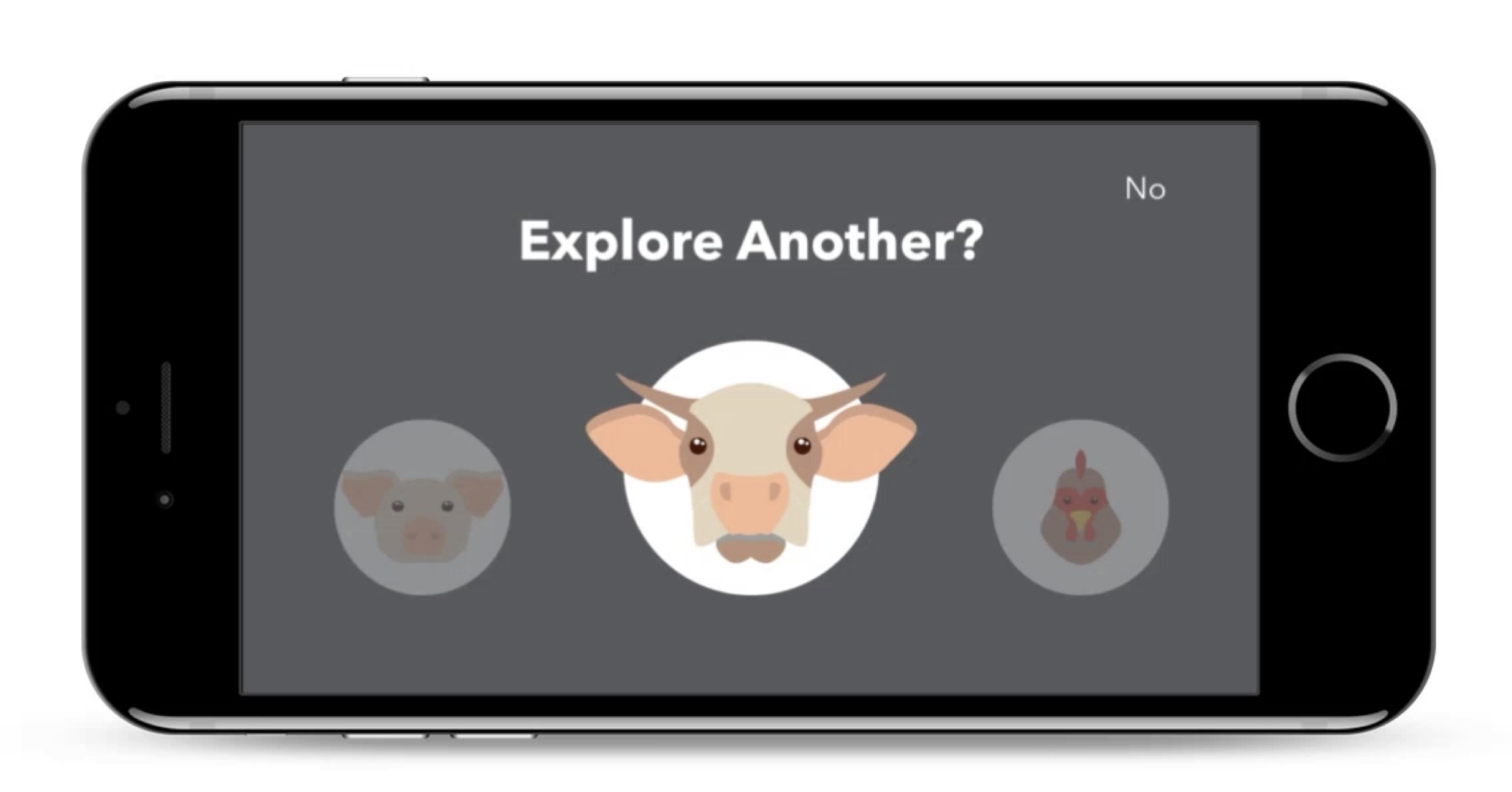
After one user test which required users to remove their phone from the Cardboard device to switch to the next experience, then put it back in — UGH — we came up with a design solution we called "The Darkroom." The Darkroom was a VR screen that popped up at the end of any of the 3D experiences and allowed a user to select the next story, or exit the VR experience, simply by long-staring at a particular button.
Navigating in VR was tricky, mostly because our design had to be platform-agnostic. Occulus and other Android headsets have some interesting features that ease navigation, but we knew that for most of our users, this was going to be their very first VR experience, and it would probably be in a Google Cardboard provided for free at a Whole Foods checkout stand. We tried a number of different gesture-based triggers to help users navigate in VR, but "the long stare" most consistently resulted in easy, understandable navigation.
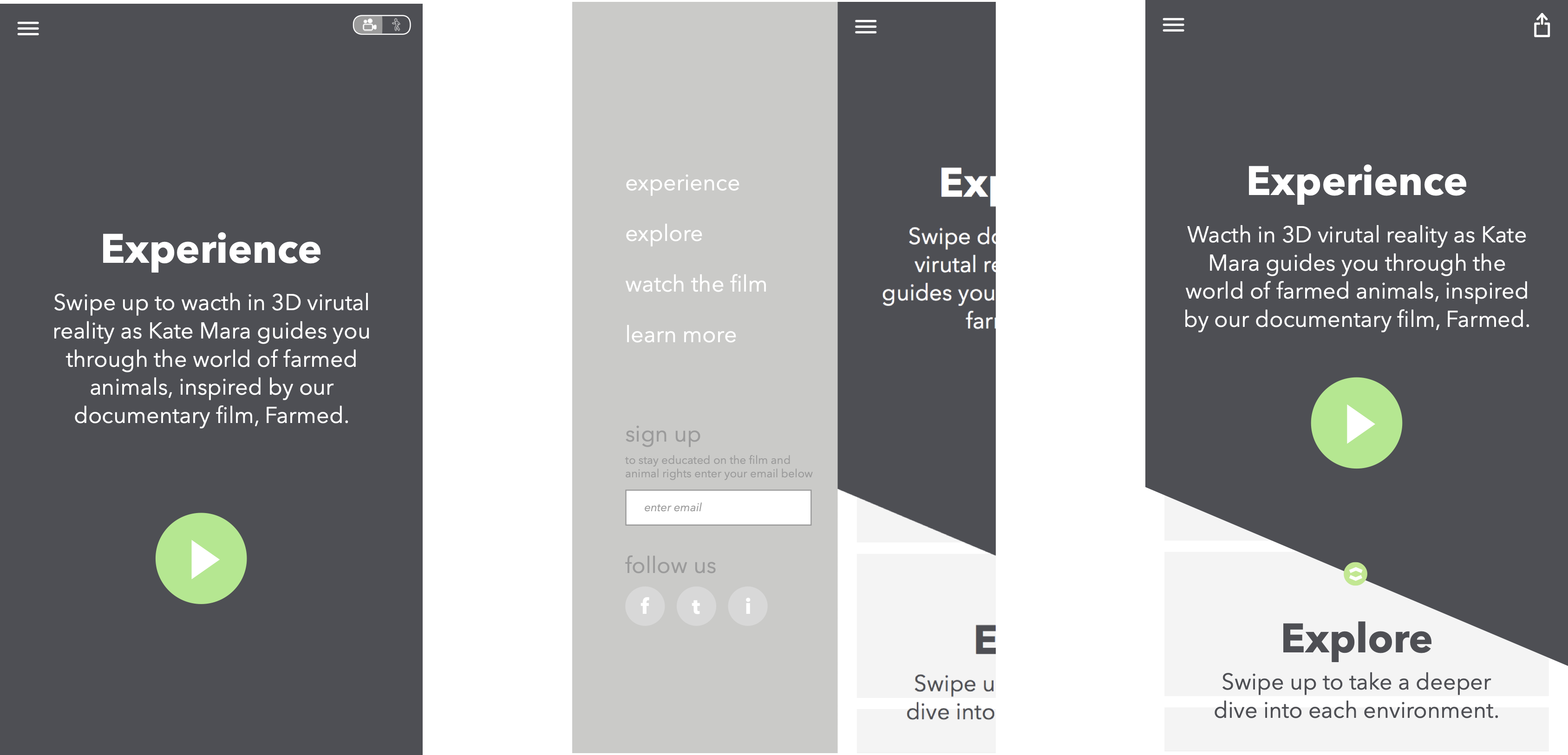
Designing the 2D App
For the 2D portion of our design, we prioritized the "Narrative" experience with layering and typography; key calls to action appeared in pop-over layers. We included a hamburger to keep navigation clear and cross-platform, but we prioritized navigation via discovery.